GEOMETRIES American Geometric Abstraction 1880 - 2016
Parfleche essay and photos ->
|
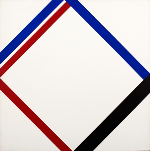
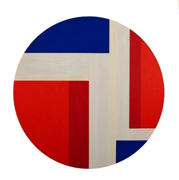
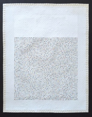
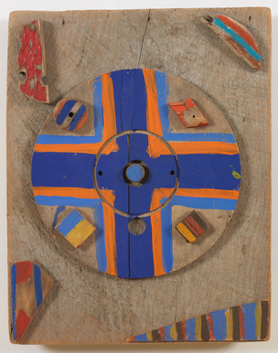
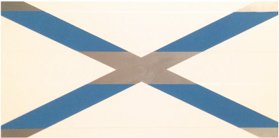
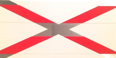
Geometric Abstraction is an artistic language that is spoken across cultures and centuries. On most art historical timelines it began in Europe in the early twentieth century. While its earliest European proponents were speaking a radical new language, the indigenous Plains and Plateau cultures of the same period were continuing a long tradition of painting that used the same pictorial elements. These elements are the basic building blocks of all art, the first artistic elements we learn, the lines, shapes and colors from which all others emerge. Cognitive science confirms that the bold colors and shapes of Geometric Abstraction reach beyond cultural boundaries to the neural receptors in our brains. Regardless of what a particular artist or school intended, regardless of culture or influence, a visual comparison of differing expressions of Geometric Abstraction is greatly enriched by having the broadest possible context. Ilya Bolotowsky and Piet Mondrian are certainly at the top of the genre’s artistic family tree. As successive generations have joined the family, extraordinary changes have taken place. While responding to same basic pictorial elements as the initial, revolutionary generation, later artists have done so with infinite variation. The purity and balance that were hallmarks of the first generation’s work often show up, but they are no longer of primary importance. Larissa Nowicki’s recent woven paper work from The Color Series uses the same primary colors, grids and circular motif that make up Bolotowsky’s Rising Tondo, but the drama and strength of the Bolotowsky have been replaced by a quiet joy, an intimate conversation on a very different scale. Nowicki also takes Bolotowsky’s non-objectivity one step further by making the manipulated medium a large part of her “subject matter “. Betty Parson’s constructions also show a reverence for medium, as she built them from scraps of wood scavenged near her home on the Long Island shore. Their surface reveals age earned in a prior life, a soul that is revitalized by the primary colors and geometric shapes parsons applied. Their naïve exuberance aligns them visually with the American Indian Parfleches. While the geometric compositions on the parfleches are too balanced and sophisticated to have been the product of impromptu inspiration, their brushstrokes have a spontaneous energy resulting from the fresco-like technique of painting on wet rawhide. In contrast, Max Estenger’s paintings are generations removed from both Parsons’ and Bolotowsky’s. His Red and Blue “X” paintings share the linear “x” motif of parfleche envelopes, as well as the balance and minimalism of Bolotowsky. Unlike the earlier works, they revel in their very contemporary, jewel-like surface that is clearly the product of the technological age. Estenger’s paintings share a compelling “thing-ness” with the raw hide parfleches too, functioning almost as three dimensional objects. They are, however, completely non-objective and non-functional, unless one considers their function of being witty and joyous. Andy Hammerstein’s Brujo is a vibrant work from his Sunspot series, a brilliant artistic interpretation of a natural phenomenon. While the sunspots in Brujo follow a well thought out, deliberate pattern, they do so with great energy and movement. They visually bridge Bolotowsky’s Rising Tondo and Nowicki’s Color Series, with the strength of one and the rhythms of the other. They also combine spatial depth with geometric precision in a unique way, and help to bring the common elements of Geometric Abstraction squarely into the twenty first century. Nancy Zander, 2016 |

